Launching your website untested onto an unsuspected audience is like running through a china shop, blindfolded with scissors. If you’ve chosen your color scheme to match Ryan Goslings eyes, picked your social media buttons because they were the first ones on the list and selected your site navigation based on your WordPress theme, you may be selling yourself short.
Conversion testing is the art of tweaking your website to maximize your sales. While you may have great instincts about what your website should look like, how it should work and what it should say, your audience may disagree completely. You’ve all read the stories on how changing the color or size of a button, or rewording an advert resulted in exponential returns, now we’re going to give you a basic guide on how to test your website to optimize conversions.
 Color me Converted
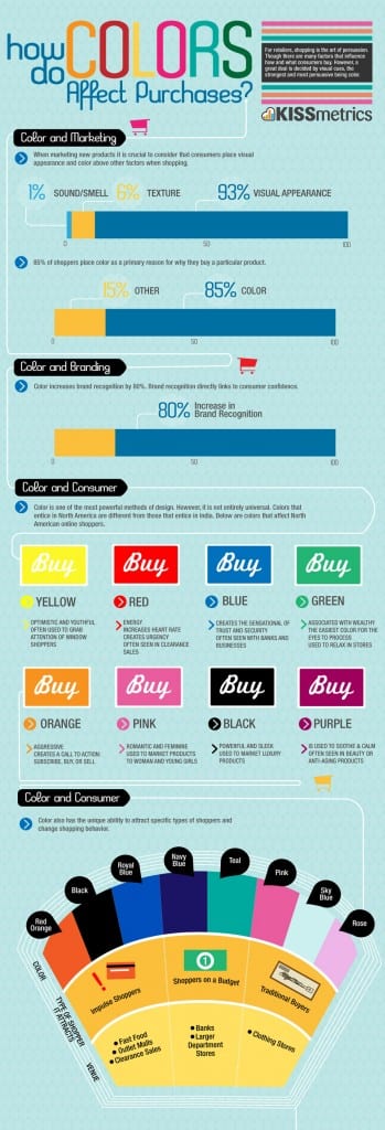
Your color scheme is far more important than your think; its why presidential candidates always wear red or blue ties and why hospitals focus on calming greens. Color psychology is the art of matching the color to the niche market. Unfortunately, there isn’t a color chart that can tell you exactly what colors to use with your clients, but there are some guidelines. This KISSmetrics Infographic to help you choose the right palette for your website.
Make tweaks to the color of your buttons, your banners and your texts to see which hues meet with the most success.
Navigation is key
When it comes to successfully moving your clients from interest to purchase, it’s all about navigation, navigation, navigation. Your navigation must be easy and intuitive. You can use your navigation to stream visitors into separate pages (by language, gender or product/service) or you can choose to highlight some navigation destinations by making those tabs bigger than other, less important ones. Remember that simple, sharp pages and fewer steps generally win out over details and complexity.
Focus
Be as focused as a cat intent on finally capturing that red laser pointer. Decide on one central goal for each page of your website, and then ensure that everything on that page is focused on that goal. If the goal of your landing page is to get your clients to browse your products or opt in with their email addresses, then ensure that there is nothing superfluous to distract their attention. Every graphic, picture, and word of text must be nudging them to fulfill the action that your page is designed for.
If your website is your focus, then you may want to trim down other services. Giving up your telephone helpline, for example, may save you cash which you can put towards free shipping or online chat services instead. Try different ways to tweak your service in order to improve conversion rates. After all, who hasn’t added an extra $9.99 book to their Amazon cart just to save $3.99 in shipping?
Every aspect of your website design and the services you offer must be tweaked and tested to optimize your conversion rate. While your marketing specialists can provide guidelines, you never know what’s going to work with your niche until you try.


